TA Service Hub
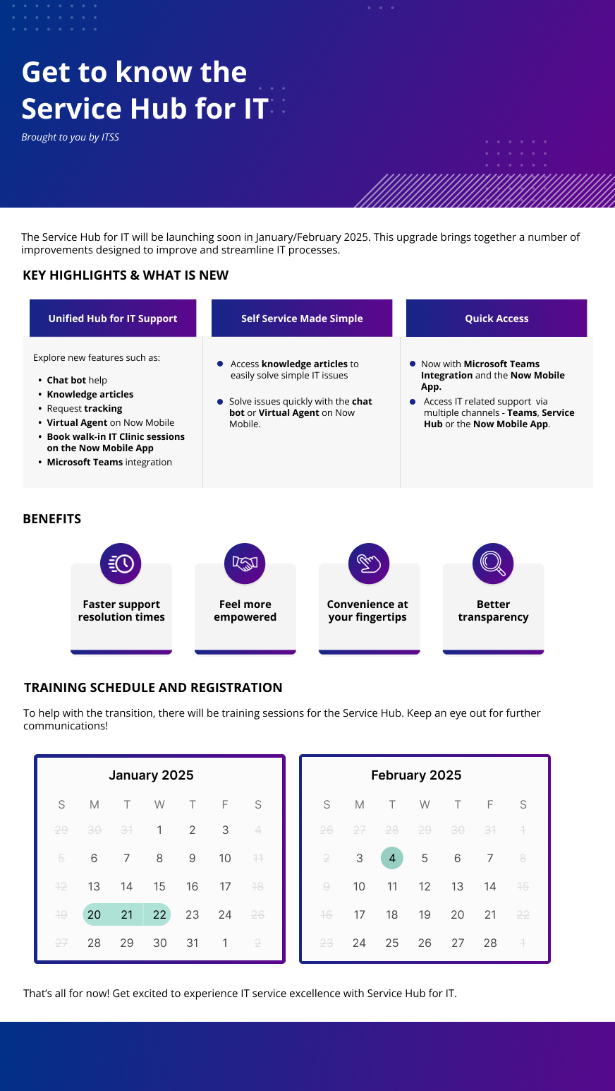
With the launch of the TA Service Hub, the client needed help with adopting the new service hub. In alignment with their change management strategy, I developed four pieces of collateral to help communicate with the end-users.
Note: Identifying logos and texts have been desensitised
Project Role
Design Lead
Duration
8 weeks
Tools
Figma
PowerPoint
Teaser
Mystery, Mistique
This poster would become the first point of contact to end-users about the TA Service Hub launch. Therefore, it held quite a bit of importance. The client emphasised mystery, anticipation and a sense of excitement as the main themes for this poster. That’s why I decided to go a bit rogue in terms of colour scheme, straying a bit from the TA branding guidelines and taking inspiration from Apple.
Newsletters
Short and sweet
There would be multiple point of contacts which the end-user would have. With planned newsletters/posters to be released before the launch.
The main goal was to stay eye-catching to the user whilst also being informative. The main challenge was keeping it short yet sweet, no-one wants to exert more energy than they need to.
I went through some different designs for the final launch poster. At first I wanted to capture the mystery and draw back to the first teaser with a dark theme, but I figured that it looked too gloomy and didn’t really capture the essence of a joyous moment such as the launch of a new website portal. The final teaser was paired with instructions on how to access the Portal.
This project was internal so it gave me some freedom integrating both 3D elements and gradients. It was a nice change of pace from my usual designs.
Launch Day
Inform yet stand out


