Multi-Day Event Application
Organising multi-day events is a complex task that involved overcoming various challenges to ensure the safety and satisfaction of attendees. Our team was engaged to understand and explore the spectator experience at multi-day events.
Project Role
UX Researcher
UI Designer
Duration
10 weeks
Tools
Figma
Miro
Problem Statement
How can we understand the spectator experience at a multi-day event held within Australia. More specifically, how can a digital platform enhance this experience?
🕵️The Research
Interviews
To gain first-hand insights into the end-to-end journey of a spectator, my team and I interviewed 19 spectators across different demographic attending similar multi-day events. I contributed to the script which included only the necessary questions to gain the most relevant responses to our research.
This was my first time conducting an interview for UX research, but with my prior knowledge from marketing I picked it up quite quickly by transferring those skills, same skills just under a different context.
Affinity Diagramming
For our research, I helped gathered over 600+ qualitative data points. I grouped these into categories, which allowed me to slowly start seeing the insights spread across all the interviews.
Here are the key takeaways from the 19 responses gathered:
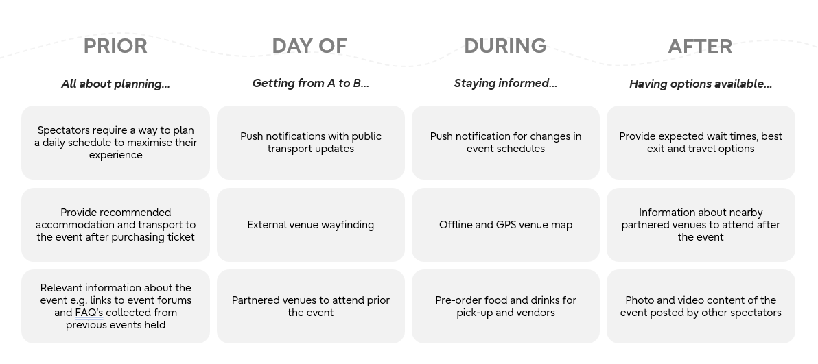
There are four key touch points for a spectator: Prior to the event, day of the event, during the event and after. These key touchpoints each illustrate a specific point in time which users could potentially interact with an application.
Spectators want a comprehensive schedule.
Venue wayfinding is really important especially in a huge event space.
User Journey Map
From our interviews, the user journey map was developed.
🎯Solution
Wireframes
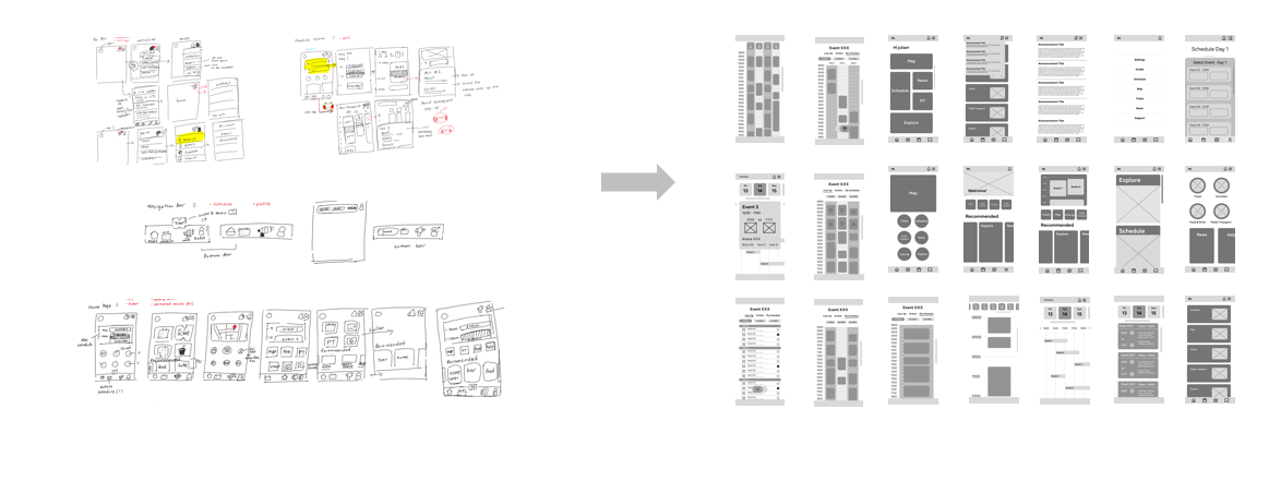
For wireframing, I tend to start with sketches to prevent myself from getting too bogged down by any certain feature or idea I might have in mind. It also helps with team discussions so we can easily change and alter any feature we want to see. One feature I found important was the navigation bar at the bottom. There was a lot of information we could put into this application and we had to prioritise what users wanted to see. So the navigation bar consisted of the home page, schedule, map and settings. Schedule and way finding were the top two pieces of information that users wanted to access.
These sketches then turned into low-fidelity wireframes done on Figma.
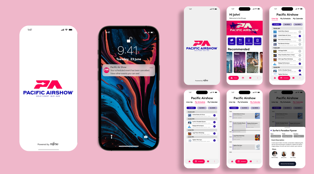
Personalise your schedule for you
The main focus was the schedule, that was the feature that users wanted the most so it is the most sophisticated in terms of design. The priority was accessibility to information.
Users can enjoy seeing the line-up, adding to their schedule for the day and overall see the calendar for the multi-day events.
Keep the fun going till later
The application not only extends to the specific event, but rather happenings around it. Users enjoy the whole experience both before and after and knowing food venues close by, transport and all other types of information was important.
I found it important to provide users with that information a provide an encompassing experience for them all.


